Though this post is literally nothing other than a "Look at my Christmas nail polish!". I wanted to do something fancy for my nails this year - my friend Lara found a great Xmas tree design that I really wanted to try. But to get the proper triangular design I needed to use sticky tape, and I didn't have the time in the lead up to Xmas to actually do it justice. So I just got out my five Christmas nail polishes and plonked them on.
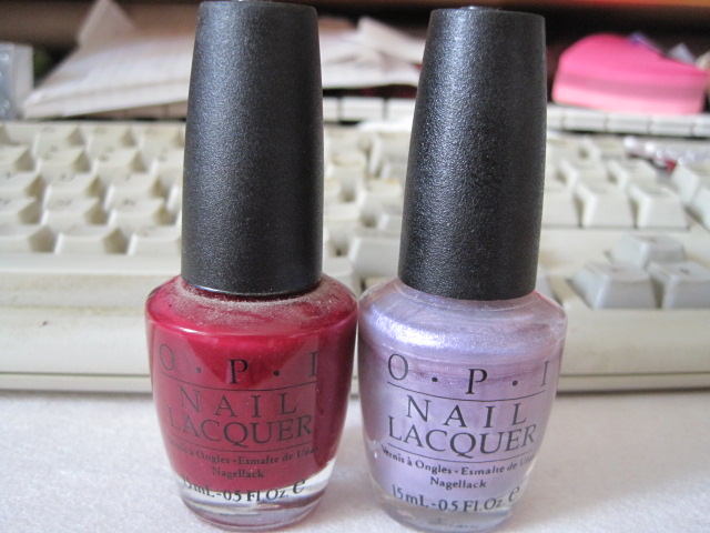
And the only reason they are Xmas nail polishes are that they are from various OPI Xmas ranges - they put out Xmas colours every year.
So we have - from left to right - Music Hall Curtain Call, Baby It's "Coal" Outside (see what they did there ;) ), Dear Santa, Merry Midnight and Gone Gonzo. I love all these colours, for various reasons.
Music Hall is a wonderful Copper type colour. Or is it Bronze? I'm so bad at all those types of colours! It does have amazing coverage on the nail - all you really need is one coat.
Baby it's Coal Outside is a wonderful sparkly black. But it is slightly less good on the coverage - needs two layers to be truly opaque.
Dear Santa is a sparkly red. And actually I think it's one of my favourite reds. But I love anything sparkly.
Merry Midnight is a sparkly purple. The coverage on this one is less good - even with the token two coats, it needs more. It is however gorgeous and I wish I had got a photo to do it justice.
And lastly Gone Gonzo - which is just blue glitter - but so tightly packed that it doesn't really need anything underneath it. And it is ultra effective - really eye catching.
Thursday, December 27, 2012
Monday, December 17, 2012
A very sneaky intermission
Just wanted to update people on the state of my bangle holder - I have started work on the hand. Based on a glove pattern that I have; I've had to make a few changes to the pattern - when I was following it, it didn't match the size of the bottom of the hand/wrist. Unfortunately, because I changed the number of stitches, I also had to change how the fingers fit into the rest of it. In this pattern, you crochet a number of stitches, chain 2 and then skip a number of stitches before crocheting the original number. And then you do that again, for another finger - it gives a basis for the fingers to be worked on. But I had to change the number of stitches to make and then to skip, and then I had to play around with my finger sizes. I didn't want them to be too big, because I still need my rings to fit on them.
And so far - this is what I have...
New Nail Polish!
This week is an exciting week - for me anyway - because I finally have some new nail polish! It's an early Christmas present from my Mum, because Adore Beauty was selling OPI bottles for about $10 - which is half the price that you'll find it at David Jones. I managed to get three colours out of her - one by itself and the other two in a pack. Usually, when I get a pack of two or more colours, I lose out somewhere; honestly, that would be the reason that I have some of the less extraordinary colours. But this time, and this pack, I really didn't lose out at all!
On the right...no, I mean left...we have Pepe's Purple Passion. Though why it's Purple, I'm not sure. Because it's the reddish-toned one. Even though it's the Muppet Collection, for me it's more of a tribute to Pepe Le Pew, my favourite Looney Tunes character.
In the middle, we have "You Don't Know Jacques", which I think is from the French collection and is a gorgeous taupe - the type of colour that is very in right now. And finally, OPI Ink. One of their more boring names (unless I'm missing something) but a colour that I spent years drooling over in the store. I could never justify it, but I always wanted it. So I was uber-excited to finally get it.
As I couldn't paint my nails evenly (unless I went in for a stripe) I painted You Don't Know Jacques and Pepe's Purple Passion on one hand, because I think they go quite well together - so well in fact, they're hard to tell apart in this picture.
And on this hand, I have OPI Ink - I just wish you could see the awesome blue glitter it has to it. It sparkles in the right light, which is just how I love my nail polish...
Sunday, December 16, 2012
Slackness...
So, once again I have been a little slack - very slack in fact - about updating this. I have only two excuses - I have been a little busy with the real world; attempting to find work sometimes can be very draining and time consuming. And my nail polish has been - to say the least - BORING! The colours have been a bit blah, and I have been too busy doing other things to update them.
So two weeks ago, we had <-- colours. Another red (very like Edin-burgundy) and a nice, if pale, purple.
Prune Danish, and I Lilac it Hot. Unfortunately, as Lilacs go, it's really not that hot at all. The purple was a bit translucent, as you can see. Pretty, in a pastel, Spring, type of way. But somehow lacking. Though, if I had done the red over the tip, as I considered, it would have looked much better
And last week, it was Pink Before you Leap - a sort of sparkly pink - and Sonora Sunset. Which is, once again, one of those classy colours that I for some reason buy and then never wear. Though, if I ever get married, I will be wearing this colour...
...well, actually, I won't. I'll be wearing It's All Greek to Me...
Unfortunately, the pink - though wonderfully sparkly - was also totally transparent.
And this was just...classy looking...
Subscribe to:
Posts (Atom)