Monday, February 11, 2013

Baby blues...and pinks

So last week my latest niece was born. I knew the day she was going to be born, but that was about it - I had no idea if I was getting a niece or nephew. As I was (and still am) excited about this birth, I really wanted to do something special with my nails. I wasn't sure what - I could have gone with fancy designs, or decals or diamantes all over my fingers but what I really wanted to do was use my favourite nail polish - my diamond dust Designer OPI nail polish. I love this stuff because it sparkles - truly sparkles. There are two different types (that I own, anyway); one has a rainbow effect in the sunlight - refracts the light in lots of different colours. The others shimmer with other tones. A purple with a blue shimmer, a pink with a blue shimmer, a pink with a gold shimmer. And as I haven't worn them for well over a year, they were something I wanted to use - and I finally had the special event.

So of course, I was planning out exactly what to do when my Mum pointed out to me that I should do a pink and blue theme. She was perfectly right, of course, but I wasn't sure that I wanted to just do 'pink and blue' or that I would have just the right shades of either. And I really wanted to use my expensive sparkly stuff!

Of course, it took about 5 minutes to realise that as I have a real weakness for blue nail polish I had a blue (or two) in the Designer series. And because pink is just a colour of nail polish that everyone should have - I had some of that as well. The only decision then was whether to go with vibrant bright/dark pink and blue, or whether to go with more restrained shades.

In the end, I went a little more restrained...

 I know this doesn't exactly *look* like a blue, but it is called Sapphire - so I think it counts. Of course, what I went for as a 'pink' is called amethyst - so I'm not sure that argument holds.


 I tried very hard to show the sparkle - but it is hard to get it. I think it's more obvious on the pink/purple than the blue.

Tuesday, February 5, 2013

New Year's to Australia Day

So I have been super lazy yet again, in keeping this updated. I admit I prefer posting about my nails when they look fabulous, rather than just posting about all the different colours. But it is a good way to keep track.

I have gone out of my pattern twice between New Year and Australia Day - instead of just using whatever colour I came to, I actually selected colours to use. The first time was New Year's Eve. Even though I didn't celebrate (and I rarely do) I like to start any year with sparkly nails.

 So the first colours I used this year were - Mad as a Hatter (from the Alice in Wonderland mini-collection) and Show it and Glow it...from...possibly the Katy Perry collection. I just wanted the colour, I didn't care where it came from.
 Because these polishes are basically glitter and nothing else, I opted to only do the one layer, with only a base coat underneath it. They are so packed with glitter that they don't need anything under them - the main problem is that they are really hard to get off for the same reason! But they look fantastic, and I do love it when my nails sparkled.

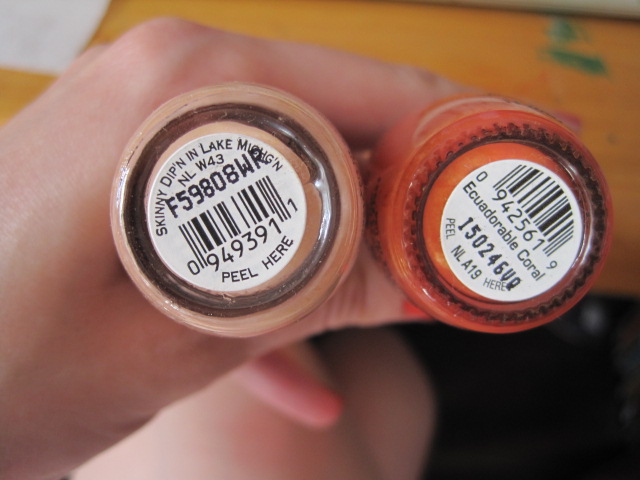
 The next week I got back to my polish by polish approach and found these - a nude (Skinny Dip'n in Lake Michig'n) and Ecuadorable Coral - which funnily, is a Coral.

 I probably could have done more exciting things with them, but I wanted to know (and show) exactly what the nude would look like. Some of them are just see through, so you can see the bare nail, but this one ended up a skin tone. Though, not mine. The coral is quite great though - when I'm in the mood for coral. Which isn't always.


 The week after that, we moved onto shades of red. They don't exactly clash, but they don't exactly match. Romeo and Juliet - a sort of sparkly, dark brown/red. And Canadian Maple Leaf, which is a shimmery brown-ish red. Well, it's a bit like what I imagine an autumn leaf to look like.
 To be clear, Romeo and Juliet is on the left, and Canadian Maple Leaf on the right. And that works for my hands, as well as in that --> picture...


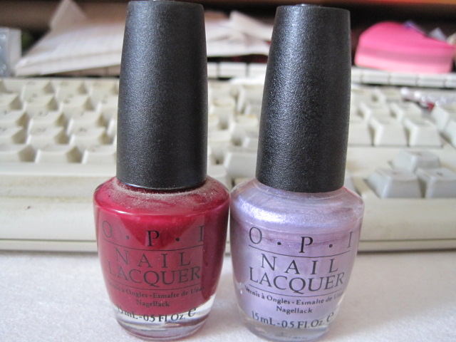
 And even MORE red! Honestly, I love the colour, but I had no idea I owned so many.
So we have OPI Love this Colour, on the Left hand, and Never Londone Shopping on the Right.
 And finally, the Australia Day colours - no I didn't just find green and yellow sitting next to the previous colours. I fished these out on purpose. Cabana Banana - a very bright yellow (and perfect for when I'm in a mood where I need yellow nail polish - and it happens) and Jade is the New Black, which is part of my search for the perfect shade of Green nail polish.

 I striped these, in an effort to make it slightly more interesting. I had moments of dreaming about painting kangaroos on my nails before I remembered a very important fact - I can't draw.

Thursday, December 27, 2012

It's Christmas!

Though this post is literally nothing other than a "Look at my Christmas nail polish!". I wanted to do something fancy for my nails this year - my friend Lara found a great Xmas tree design that I really wanted to try. But to get the proper triangular design I needed to use sticky tape, and I didn't have the time in the lead up to Xmas to actually do it justice. So I just got out my five Christmas nail polishes and plonked them on.

And the only reason they are Xmas nail polishes are that they are from various OPI Xmas ranges - they put out Xmas colours every year.

So we have - from left to right - Music Hall Curtain Call, Baby It's "Coal" Outside (see what they did there ;) ), Dear Santa, Merry Midnight and Gone Gonzo. I love all these colours, for various reasons.

Music Hall is a wonderful Copper type colour. Or is it Bronze? I'm so bad at all those types of colours! It does have amazing coverage on the nail - all you really need is one coat.

Baby it's Coal Outside is a wonderful sparkly black. But it is slightly less good on the coverage - needs two layers to be truly opaque.
 Dear Santa is a sparkly red. And actually I think it's one of my favourite reds. But I love anything sparkly.

Merry Midnight is a sparkly purple. The coverage on this one is less good - even with the token two coats, it needs more. It is however gorgeous and I wish I had got a photo to do it justice.
And lastly Gone Gonzo - which is just blue glitter - but so tightly packed that it doesn't really need anything underneath it. And it is ultra effective - really eye catching.

Monday, December 17, 2012

A very sneaky intermission

Just wanted to update people on the state of my bangle holder - I have started work on the hand. Based on a glove pattern that I have; I've had to make a few changes to the pattern - when I was following it, it didn't match the size of the bottom of the hand/wrist. Unfortunately, because I changed the number of stitches, I also had to change how the fingers fit into the rest of it. In this pattern, you crochet a number of stitches, chain 2 and then skip a number of stitches before crocheting the original number. And then you do that again, for another finger - it gives a basis for the fingers to be worked on. But I had to change the number of stitches to make and then to skip, and then I had to play around with my finger sizes. I didn't want them to be too big, because I still need my rings to fit on them.

And so far - this is what I have...


New Nail Polish!

This week is an exciting week - for me anyway - because I finally have some new nail polish! It's an early Christmas present from my Mum, because Adore Beauty was selling OPI bottles for about $10 - which is half the price that you'll find it at David Jones. I managed to get three colours out of her - one by itself and the other two in a pack. Usually, when I get a pack of two or more colours, I lose out somewhere; honestly, that would be the reason that I have some of the less extraordinary colours. But this time, and this pack, I really didn't lose out at all!

 On the right...no, I mean left...we have Pepe's Purple Passion. Though why it's Purple, I'm not sure. Because it's the reddish-toned one. Even though it's the Muppet Collection, for me it's more of a tribute to Pepe Le Pew, my favourite Looney Tunes character.
 In the middle, we have "You Don't Know Jacques", which I think is from the French collection and is a gorgeous taupe - the type of colour that is very in right now. And finally, OPI Ink. One of their more boring names (unless I'm missing something) but a colour that I spent years drooling over in the store. I could never justify it, but I always wanted it. So I was uber-excited to finally get it.
 As I couldn't paint my nails evenly (unless I went in for a stripe) I painted You Don't Know Jacques and Pepe's Purple Passion on one hand, because I think they go quite well together - so well in fact, they're hard to tell apart in this picture.
And on this hand, I have OPI Ink - I just wish you could see the awesome blue glitter it has to it. It sparkles in the right light, which is just how I love my nail polish...

Sunday, December 16, 2012

Slackness...

So, once again I have been a little slack - very slack in fact - about updating this. I have only two excuses - I have been a little busy with the real world; attempting to find work sometimes can be very draining and time consuming. And my nail polish has been - to say the least - BORING! The colours have been a bit blah, and I have been too busy doing other things to update them.


 So two weeks ago, we had <-- colours. Another red (very like Edin-burgundy) and a nice, if pale, purple.
 Prune Danish, and I Lilac it Hot. Unfortunately, as Lilacs go, it's really not that hot at all. The purple was a bit translucent, as you can see. Pretty, in a pastel, Spring, type of way. But somehow lacking. Though, if I had done the red over the tip, as I considered, it would have looked much better
 And last week, it was Pink Before you Leap - a sort of sparkly pink - and Sonora Sunset. Which is, once again, one of those classy colours that I for some reason buy and then never wear. Though, if I ever get married, I will be wearing this colour...
 ...well, actually, I won't. I'll be wearing It's All Greek to Me...
 Unfortunately, the pink - though wonderfully sparkly - was also totally transparent.
And this was just...classy looking...

Wednesday, November 28, 2012

Some design...

I think this week is the first time I've been truly surprised and happy with the nail polish I dragged out of the back of my bookcase. Because this week, I pulled out "It's All Greek to Me" which is my all-time favourite colour. Along with Pistol Packin' Pink, which is less beloved, but does work well with the other.

 And when I say this is my favourite colour, if you made me choose from all the bottles I have (and believe me, there are many bottles to come) this is the one colour I could never do without. Admittedly, I would prefer it if you didn't make me choose...
 I was also happy because these colours work well together. I've been a bit tired of clashing colours that I can't even wear on the same hand, let alone the same nail. And I also got a bit tired of one colour on one hand. I can't remember the last time I limited myself in that way. So I wanted to do something different - something new - and these colours were perfect!
 One of my friends sent me a link to a nail polish blog a few weeks ago, and they had some nice simple designs that I had never thought to do before. Admittedly, I didn't think I would be doing them any time soon - especially with the colours I have been dragging out lately. But I realised this week was perfect. First I covered all my nails in Pistol Packin' Pink (2 layers).
Then I just used one layer of It's All Greek to Me and painted it diagonally across the top of the nail. Technically I should have used tape of something to make it neat, but I'm a bit impatient like that. And I have to say - I love it! the colours work well together and my nails look fancy and funky at the same time. Honestly, I'll be hard pressed not to do this style all the time now...